In this post, we give Dylan Madden of CalmAndCollected.com some quick pointers on his website.
Critiquing a self-improvement blog
In this week’s video, we critique yet another website. This time around, we’ve moved into the sphere of online marketing and blogging — as a matter of fact, we’ll be critiquing an up-and-coming self-improvement blog run by Dylan Madden. Without further ado, here’s the video:
Here are the main takeaways:
- It’s important to systematise design.
- One thing that sets professional websites apart from amateur ones is consistency.
Make sure you use the same fonts, image “styles” (and resolutions!), and color palettes across your entire website.
If you’re a blogger, it might even make sense to create some simple editorial guidelines, defining how you’ll use different headings (H1, H2, H3 tags etc.), when you bold or italicise things, and so on.
This will make you look more professional and make the process of publishing guest posts or scaling your blogging business easier.
- One thing that sets professional websites apart from amateur ones is consistency.
- Be careful with how you underline links.
- The way you design links is important. On the one hand, you want to make it easy for your users to know when something is clickable and when something isn’t.
On the other hand, if you’re using custom link underlines (maybe they’re thicker than the default ones, or maybe they’re further down from the text), things can start to look tacky real quick. This is especially the case with pages that contain a lot of links. (See for example Dylan Madden’s archive page below)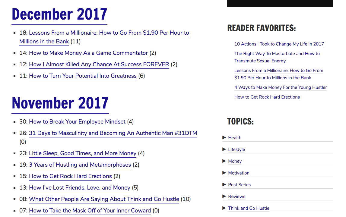
For a cleaner look, it might make sense to remove the underlines altogether. Unless you’re dealing with a very old audience, it’s pretty safe to assume people know that colored text = clickable link.
- The way you design links is important. On the one hand, you want to make it easy for your users to know when something is clickable and when something isn’t.
- Improve the user experience by limiting the user’s choices.
- This might sound counterintuitive at first. Having plenty of choices is a good thing, right?
Not really.
Have you ever gotten stuck at an aisle in the grocery store because there was too many different things to choose from and you couldn’t make a decision? Probably made you a little anxious and stressed out, right?
That’s called the Paradox of Choice.
- Presenting your reader with too many options overwhelms them, and more often than not, they’ll just opt-out of having to make a decision at all (by, you know, closing the tab and doing something else). It’s up to you to make decisions for them.
- This might sound counterintuitive at first. Having plenty of choices is a good thing, right?
- Keep an eye on your backlink profile.
- The key to self-improvement is self-awareness. The key to good SEO… is also self-awareness.
In Dylan’s case, we noticed he’d moved his website from one domain to another. When he did that, he set-up 301 redirects from his old domain to his new one — just as you should. Despite doing everything right, some months later, something happened with his old domain… The 301 redirects broke… And his backlink profile dropped dramatically.
Use a program like Ahrefs or Majestic to keep an eye on your backlink profile. Personally, we use and recommend Ahrefs.
- The key to self-improvement is self-awareness. The key to good SEO… is also self-awareness.
- Don’t put external links in your navigation menu.
- The purpose of the nav menu is to make it easier for users to navigate to critical pages on your website. In 9 cases out of 10, it’s a really bad idea to put external links in there — especially if you don’t indicate that they’re external (by including an external link icon, for example).
As a side note, if you want to cross-promote your YouTube channel or other types of content that you publish elsewhere on the web, “integrate” them into your normal blog content. Use them to provide extra value, not as a substitute.
- The purpose of the nav menu is to make it easier for users to navigate to critical pages on your website. In 9 cases out of 10, it’s a really bad idea to put external links in there — especially if you don’t indicate that they’re external (by including an external link icon, for example).
Alright. That’s it for today’s website critique. Hope you got some value out of it!
PS. Want us to review your website? Shoot Jon an email: jon [at] marketingidiots [dot] co.